
| Font: | HFF Quick Draw |
| Author: | Have Fun with Fonts |
| Post Date: | August 21, 2010 |
| Comments: | HFF Quick Draw is based on Robard from page 76 of Condensed Alphabets: 100 Complete Fonts by Dan X. Solo and also on page 190 of The Solotype Catalog of 4,147 Display Typefaces as Robards. |
From: HFF <have@fun.fonts> Date: Sat, 21 Aug 2010 13:01:15 +0200 Subject: Introducing HFF Quick Draw Newsgroups: alt.binaries.fonts HFF Quick Draw is based on Robard from page 76 of "Condensed Alphabets: 100 Complete Fonts" by Dan X. Solo. Robard is listed as Robards on page 190 of "The Solotype Catalog of 4,147 Display Typefaces". HFF Quick Draw is a free font. You are free to use this font in any way you want to. You can share this font with others if you wished to. Use freely, share freely and, most of all, enjoy the font. Have fun HFF Attachment: HFF Quick Draw.zip [See font download link below] Attachment: HFF-Quick-Draw.gifAttachment: robard.gif

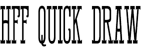
From: Character <Char@cters.bold.italic> Date: Sun, 22 Aug 2010 18:58:24 -0700 Subject: Re: Introducing HFF Quick Draw (repost) II Newsgroups: alt.binaries.fonts [....quoted text snipped....] I wonder why he clipped the tail off the "Q" ...
From: claude <claudeserieux©gmail.com> Date: 23 Aug 2010 03:34:57 +0200 Subject: Re: Introducing HFF Quick Draw Newsgroups: alt.binaries.fonts The advance with (500) for glyph CR is greater than the maximum (397). FontForge affiche cette avertissement. Vous faites une belle job. claudeTranslation:FontForge displays this warning. You made a beautiful job.
From: HFF <have@fun.fonts> Date: Tue, 24 Aug 2010 10:30:50 +0200 Subject: HFF Quick Draw 1.1 Newsgroups: alt.binaries.fonts The changes made on HFF Quick Draw version 1.1 1. Changed the width of .notdef to 0. I set it to a very low value in version 1.0 and decided to zero it out in this version. Is this the right thing to do? 2. Decreased the width of the space character by a fraction. I felt it was a bit too wide in version 1.0 3. Decreased the width of CR. I never touched the CR glyph. I will look at this from now on. Thanks to Claude for mentioning this. 4. The most important thing in this update, fixed the tail of Q. The tail got chopped off somewhere along the way. This is the reason why the Q looked awkward when I made the preview image and I did not even compare it to the source image. Thanks to Character for spotting this discrepancy. Thank you very much Claude for reposting the message to abf. Enjoy - HFF Attachment: HFF Quick Draw v1.1.zip
| FONT DOWNLOAD | Open Type + True Type + Type 1 |