
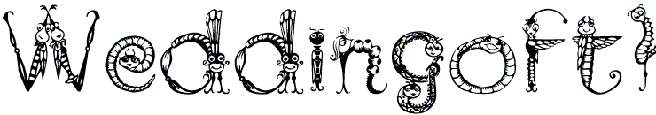
| Font: | Wedding of the Bugs TV |
| Author: | Traitor Vic |
| Post Date: | June 6, 2009 |
| Comments: | Wedding of the Bugs TV is based on Tarantella from page 89 of Special Effects and Topical Alphabets: 100 Complete Fonts by Dan X. Solo and also on page 69 of The Solotype Catalog of 4,147 Display Typefaces. |
@ in email addresses that appear to be valid were replaced with ©.
From: Traitor Vic <traitorvic©gmail.com>
Date: Sat, 6 Jun 2009 02:26:13 -0400
Subject: Subject: My First Fonts - One More and Then I'll Shut Up. I Promise.
Newsgroups: alt.binaries.fonts

Alrighty, then!

I've gotten some great feedback on the first pile. Thanks, Guys & Gals! This
has been a wonderful experience. I'm gonna end it now with a final blowout!

Several of the fonts that I've created and shared up to this point are
already available as freeware fonts. I knew of several of them going in, but
I built these fonts as a learning experience and not as anything I ever
expected to receive praise or monetary compensation for, so you get what you
get and anything you give back is greatly appreciated.

This one, though, is one I've never seen made available before. I'm sure
that Character can correct me (and hope that he will) if I'm wrong, but I've
searched around and can't find it. Too band most Font Sites don't list a
category Fonts Shaped Like Bugs.

This is also from the afformentioned Solotype catalogue. It was run through
ScanFont5 and FontLab5 and this is what came out.

I named it "Wedding of the Bugs" after a song by Robbie Fulks. He Rocks (in
a very Countryfied, Twangy way) and should be paid attention to.

Any forthcoming fonts from Traitor Vic's TV Fonts will, I promise, be
Original Designs or (at least) stolen from far less common and well known
source materials. Unless I feel like doin' a quickie or something.

Thanks for everything, folks! I'll see ya 'round!


Attachment: Wedding of the Bugs TV.otf     [See font download link below]

From: Character <Char@cters.bold.italic>
Date: Sat, 06 Jun 2009 11:11:42 -0700
Subject: Re: My First Fonts - One More and Then I'll Shut Up. I Promise.
Newsgroups: alt.binaries.fonts

[....parts of message snipped....]

> This is also from the afformentioned Solotype catalogue.

What you previously mentioned was one of the many Dan Solo/Dover
alphabet books, which are mostly topical collections of images of
relatively full alphabets.

The VERY useful "Solotype Catalog" is a compendium of 4,147 typefaces
(at least that's the count given on the cover) mostly with one-line
samples. Check it (and become addicted) here - make sure you use the
'look inside this book' feature:

http://www.amazon.com/Solotype-Catalog-Display-Typefaces-Pictorial/dp/0486271692


> It was run through
> ScanFont5 and FontLab5 and this is what came out.

Time to get a little technical.

Take one of your fonts back into FontLab, open a glyph, and turn on
the Font Audit (icon is a yin-yang symbol, or press Ctrl-Shift-F)

You may not like what you see ...  compare with an existing font.

Autotracers like ScanFont work reasonably well with simple designs.
There are two kinds of outlines that ScanFont can produce: Too tight
and detailed, and Too loose. Depending on your scan settings, they can
produce many useless artifacts - extra nodes, invisibly small
features, missing parts, unconnected outlines, and more. Manual
editing is always required, although it often depends on what size the
font is used at whether these have any visible effects. Fonts made
from extremely complex tracings can create so many nodes that opening
them can crash Windows! That's the voice of experience talking :)

Scanfont also plays fast and loose with metrics and sizing unless
closely monitored; particularly the newer versions of ScanFont (which
version are you using?). If you look at your Wedding Bugs, the UPM
size (click on font properties/metrics) is properly 1000, but the caps
height is 1063 and the ascenders (large lower case) reach 990. Caps
should normally be about 70-80% of the UPM size with similar ascender
heights. Except for flourishy scripts and swashes, individual glyphs
shouldn't approach the UPM in size. If you look at your font in
FontLab's preview metrics window, you'll see that the tops of the
characters in the first row are cut off. This may not happen when the
font is used.

Also take a look, for example, at the ¢ (cents) sign, which inherited
some extremely wrong sizing.

> I named it "Wedding of the Bugs" after a song by Robbie Fulks. He Rocks (in
> a very Countryfied, Twangy way) and should be paid attention to.

Renaming is good; This name is a great name!! It would be a nice touch
if when you posted (or maybe even somewhere inside the font) you
mentioned what the fonts' origins are. In this case, it's 'based on
Tarantella from the Solotype Catalog'

> Any forthcoming fonts from Traitor Vic's TV Fonts will, I promise, be
> Original Designs or (at least) stolen from far less common and well known
> source materials. Unless I feel like doin' a quickie or something.

You're right. The more common source materials have generally been
digitized - for better or worse, but there are some significant
exceptions. I had done quite a few myself before I discovered that
they'd already been done, and far better than my attempts - mostly. It
takes some serious hunting to find the ones that haven't been done.

In a separate thread, if he agrees, I'm going to post an excel
spreadsheet produced by "Fontana" last October that indexes the
Solotype Catalog and gives information about which of the Catalog
entries exist as digitized fonts, with the fonts' names and sources.

I don't have the Alphabet book(s?) of 100 alphabets each that you
have, and don't know how many of them use the same names for the same
faces. What's the actual name of the book you're using that has these
alphabets in it?

I do have all or most of the Dover/Solo 24-font books with CD that
were produced more recently. They include fonts digitized by Solo. If
you search for 'solotype' at Myfonts, you'll find more of his
digitizations - many of those have different names than in the
catalogs. Just to keep things confused!

> Thanks for everything, folks! I'll see ya 'round!

I certainly hope so!!

    - Character
| FONT DOWNLOAD | Open Type |